Saturday, April 26, 2014

Final Portfolio Design Pages

I moved my reviews to a different page and played around with some spacing that differs from my original sketches.  I'm not thrilled with the In the News page or really the home page since it looks kind of bare but I really like how the rest turned out.  Let me know what you think!


Home page:


Posters page:


Book Covers page:


E-cards page:


About Me pages:


Contact page:


In the News page:


Tuesday, April 22, 2014

Portfolio Web Design Sketches


Above are the sketches for my web design.  I have chosen to design a hypothetical portfolio for myself.  I created a home page with links across the header for the different varieties of project we've put together which include posters, e-cards, and book covers.  While I will post my original works under those headings, I will likely have to borrow place holders for the other grid blocks shown above as I honestly only have one example for each at the moment.  Additionally, I have a sidebar containing links to an "About Me" tab, an "Contact" tab, and an "In the News" tab.  The "About Me" is fairly plan with just a picture of me along with some text.  The "Contact Me" page will have the usual fields for an email template, but next to it will be a list of "reviews" from people who have viewed or used my work before to help promote me.  The "In The News" tab will direct viewers to links where I've been mentioned in the news or in magazines along with thumbnails from the articles to showcase my professional network and acclaim.  All of the content-based pages that show the images I have created will be set up the same way, with a grid along the top and, when an image is clicked, a larger version of it will appear below the grid line.  Arrow keys on both sides of the larger image will allow viewers to scan through the enlarged images from that view.  I haven't really decided what colors or themes I will have the background images be yet, but I have a general idea of where I want everything.  I want it to be fairly straight-laced and easy to get through, but with a little flourish to the designs.  Based off of this module's Lynda.com tutorial, I have some ideas for things like the buttons and presentation of the images, however I plan to basically use trial and error to decide what I like the look of for my site.

Saturday, April 12, 2014

Final E-Card

I had to move the front cover around a little bit from my original sketch due to the picture I found.  The font is a bit hard to read, but with the parameters so small it was hard to make it bigger because it would throw off all the spacing I decided on.  Let me know what you think!


Monday, April 7, 2014

Back of E-Card

I, like some others, didn't quite understand the 3-sectioned e-card so I have added a sketch of what will now be my back cover here:


Since my card is about ways to help heal our Earth, my back cover will have a title of "Ways to Help" or "Ways to Heal" (haven't decided which one yet.)  There will be individual squares that will show pictures of ways people can help cut down on air pollution with text above them explaining what each image is representing.  I think it would make the most sense to have a pale green background with maybe a tinge of brown in a gradient effect behind the text and boxes as the color scheme.

Environmental E-Card Sketch

Here is my e-card sketch:


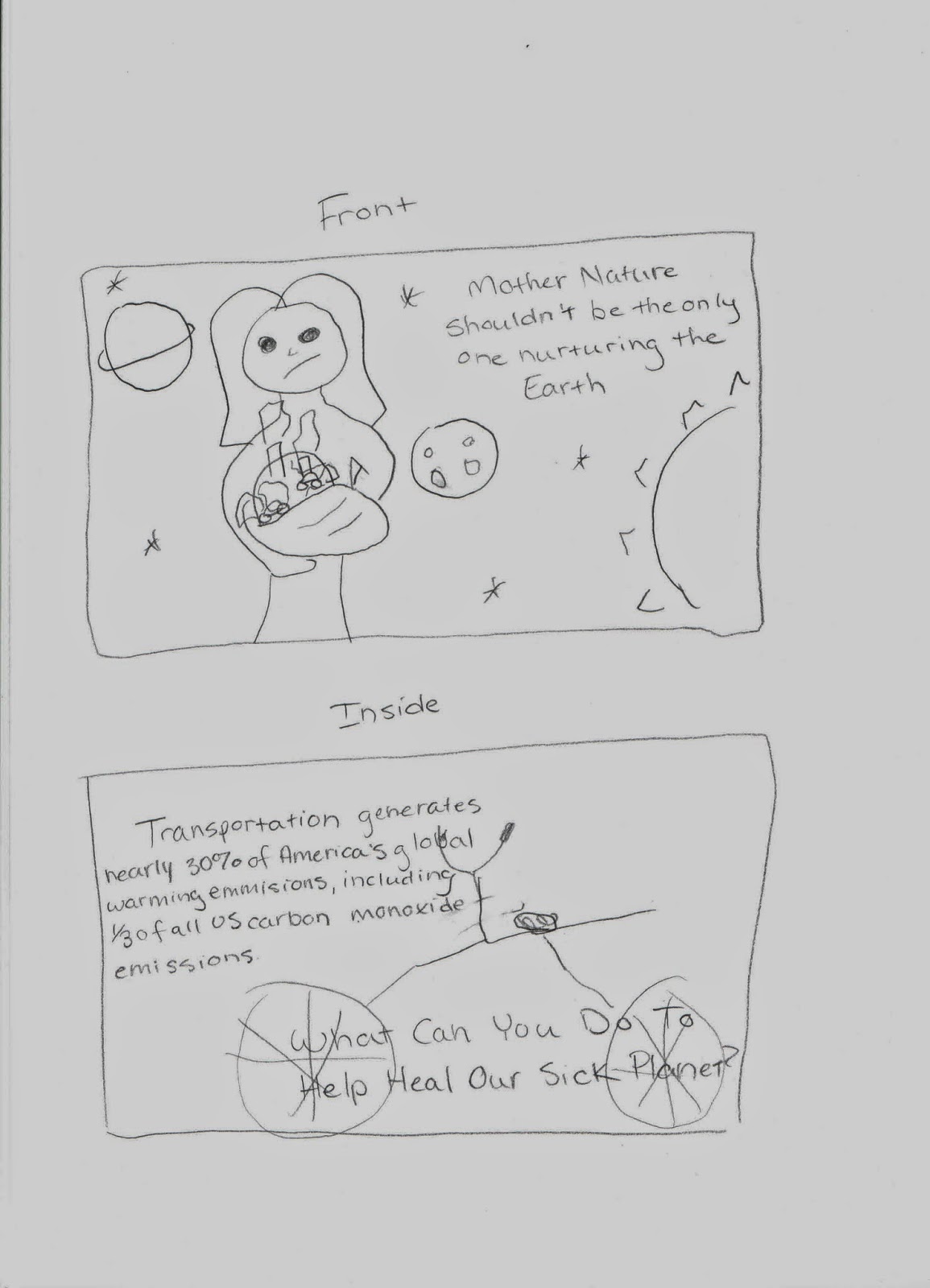
  The point of the card is to have the Earth appear as a sick child to "Mother Nature" which is the female figure holding the planet on in the first sketch.  If I can find a sufficient image, I would like the Earth to appear to be swaddled like a baby.  They may be a bit hard to see, but I put a couple of small cars and smoke stacks on the Earth's surface that are all producing smoke.  Color wise, I would like the Earth to appear as very dull and darkened as if it were ill.  The background of the image I would like to be space with other planets operating as they typically do behind the mother while the mother tries to tend to her sickest "child."  I would like the other colors of the background to be brighter and graphic so as to accentuate the contrast between the Earth's status and their's.  The message, "Mother Nature shouldn't be the only one nurturing the Earth," is meant to convey that we all have to play a part in preventing pollution from harming our planet.  We can't just rely on nature to regulate itself anymore. On the inside, I have a statistic that I found here:  http://www.ucsusa.org/clean_vehicles/why-clean-cars/global-warming/ that pertains to air pollution caused by vehicle emissions to tie in the smoke-making items on the Earth.  And finally, a call to action with, "What Can You Do to Help Heal Our Sick Planet" on the other side.  I also want to have a fairly non-opaque image of a bike, maybe on a lawn in the background implying that biking may be something people could do to help cut down on air pollution. I haven't yet decided on font, but I know that I don't want it to be as typewriter-ly as my awareness poster text was this time.  Nothing too terribly bold either as I don't want to scare viewers too much..  Let me know what you think!